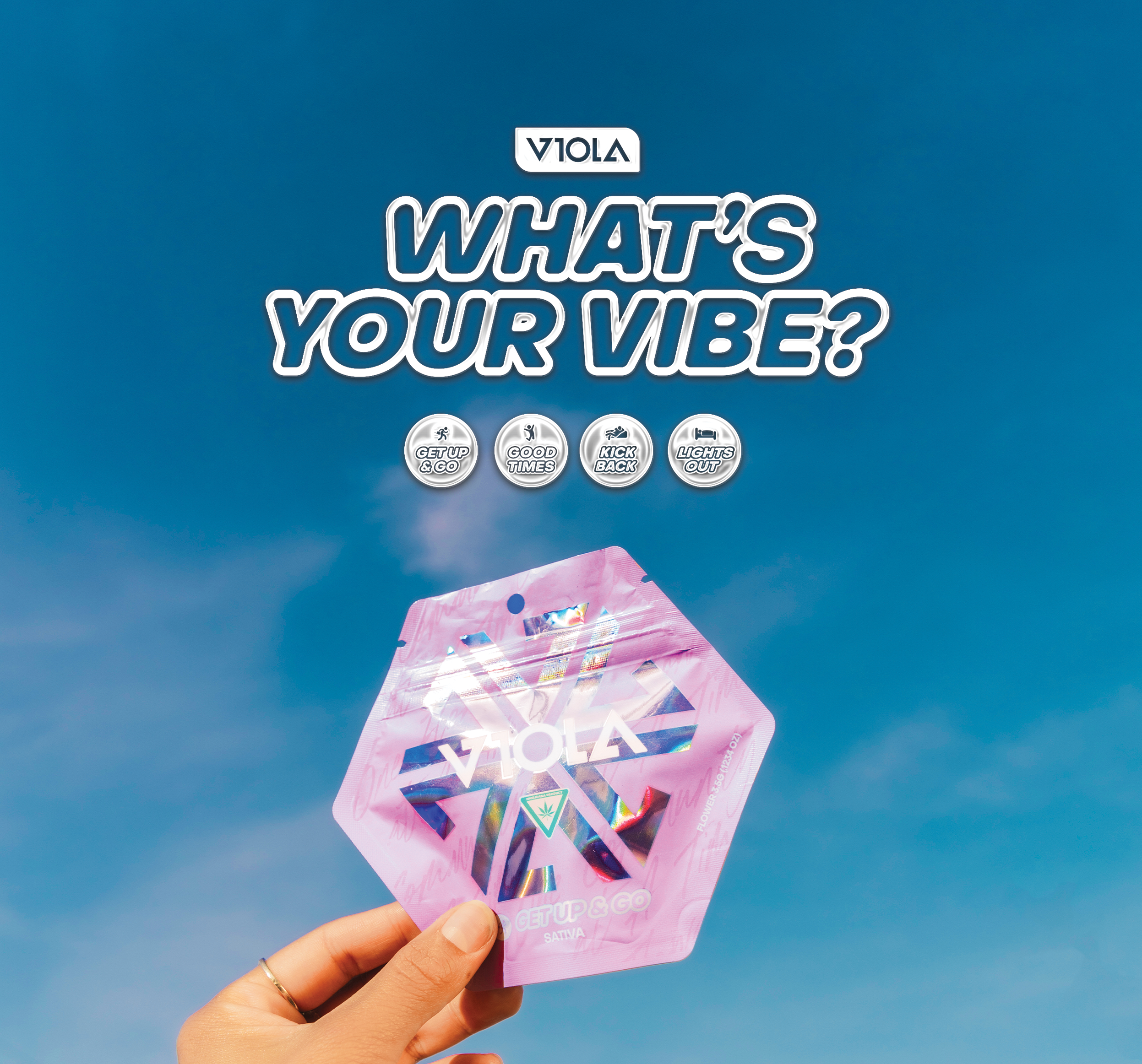
Project Overview
When I joined Viola’s team, they had a stellar reputation, excellent indoor grown flower and were single-handedly establishing a new level of black-ownership in the cannabis industry. During my time, we expanded to 8 new states and Canada. But before the growth, there needed to exist a sustainable, consistent, design system for their products that would become the foundation for new growth. They had several well-known strains but were lacking in customer brand awareness and visual consistency. Our goal as a team was to establish a sales strategy and a matching product rebrand that would bring brand loyalty and entice new product users. We needed to re-introduce ourselves, not only as the new staple but a new standard of premium indoor flower.
Team
Art Direction & Design | Myself
Marketing Specialist | Najee Tyler
Social Media Strategist | Trevon Palmer
Photography | Daniel Jester
My Contribution
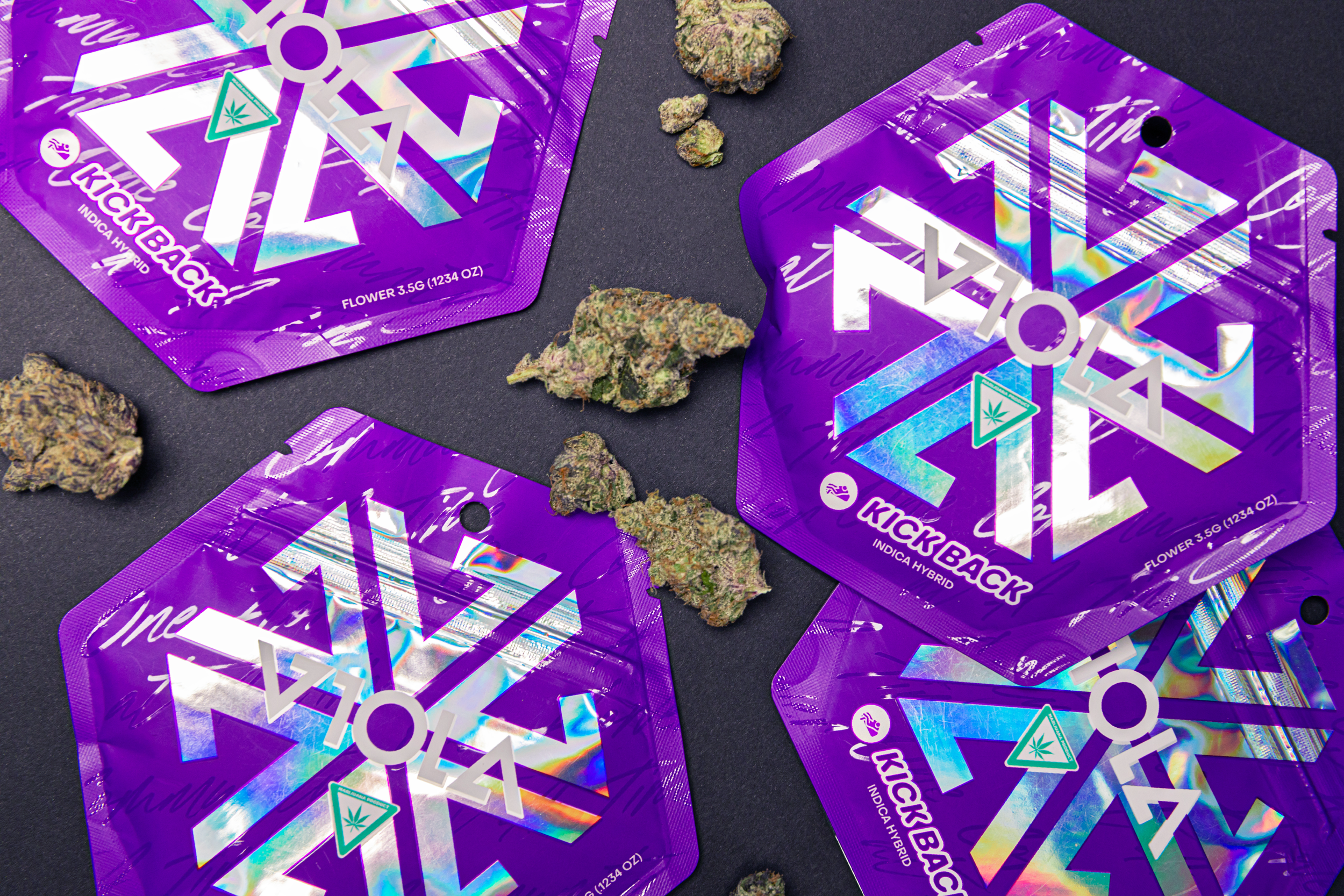
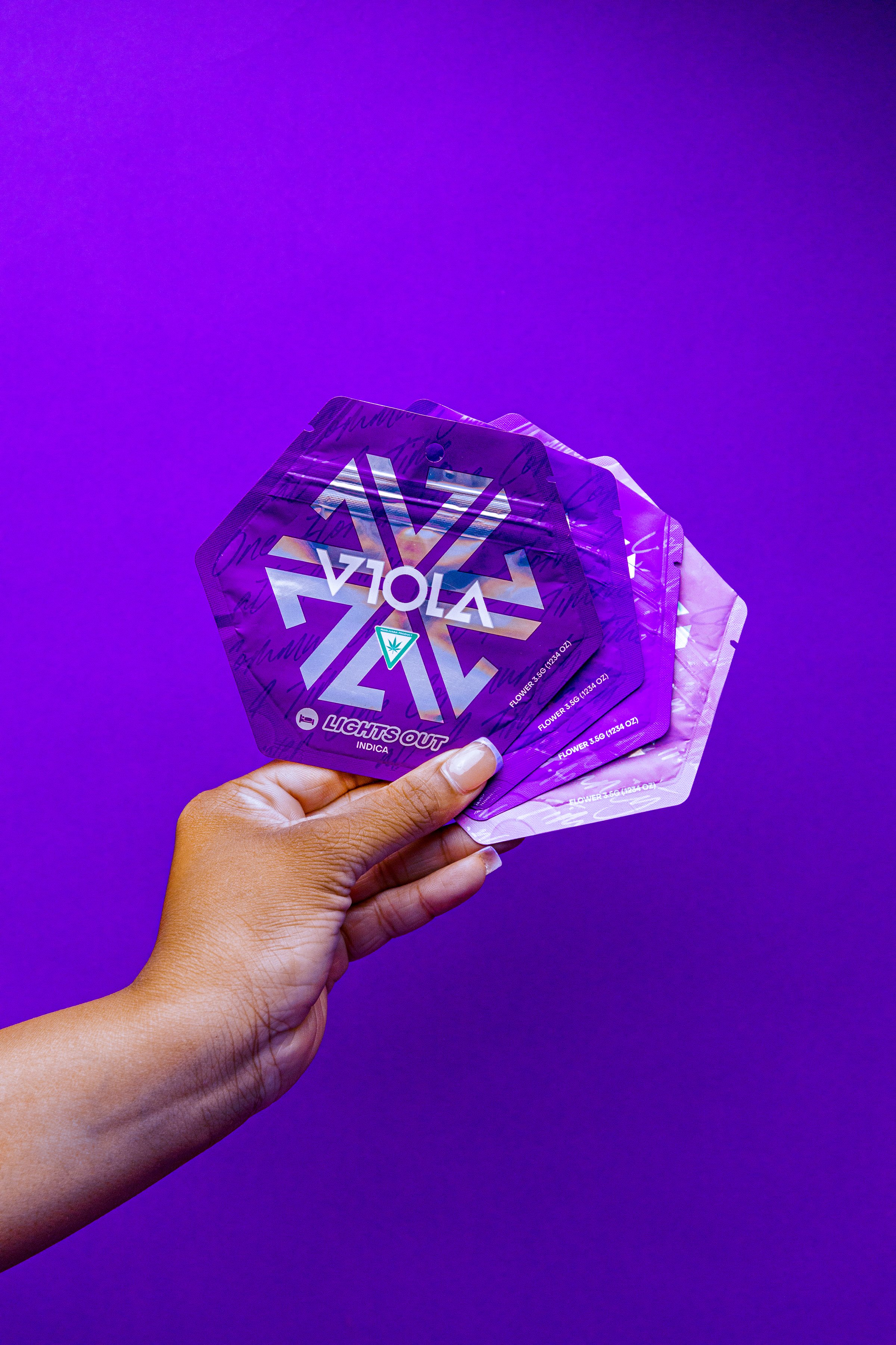
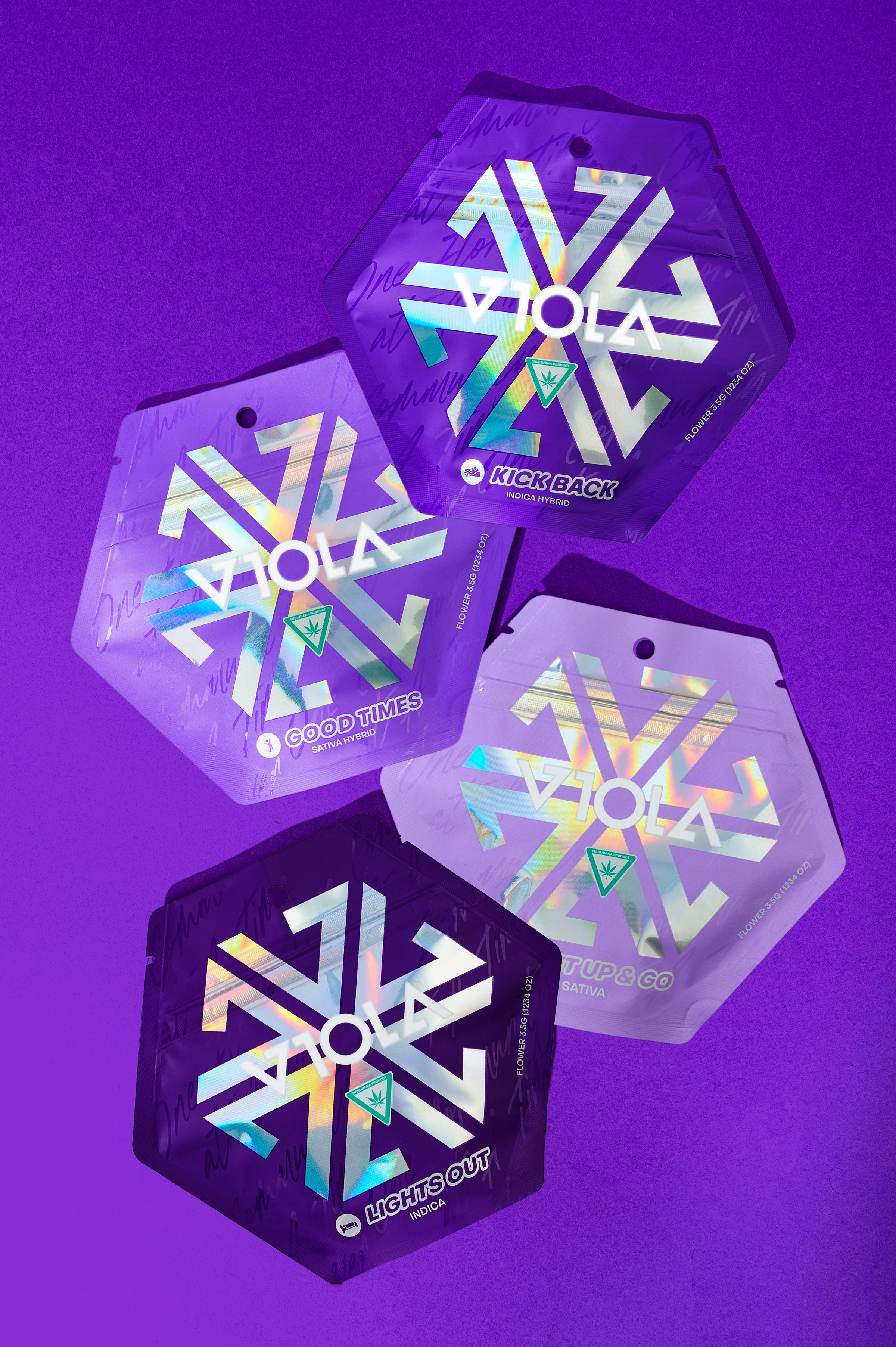
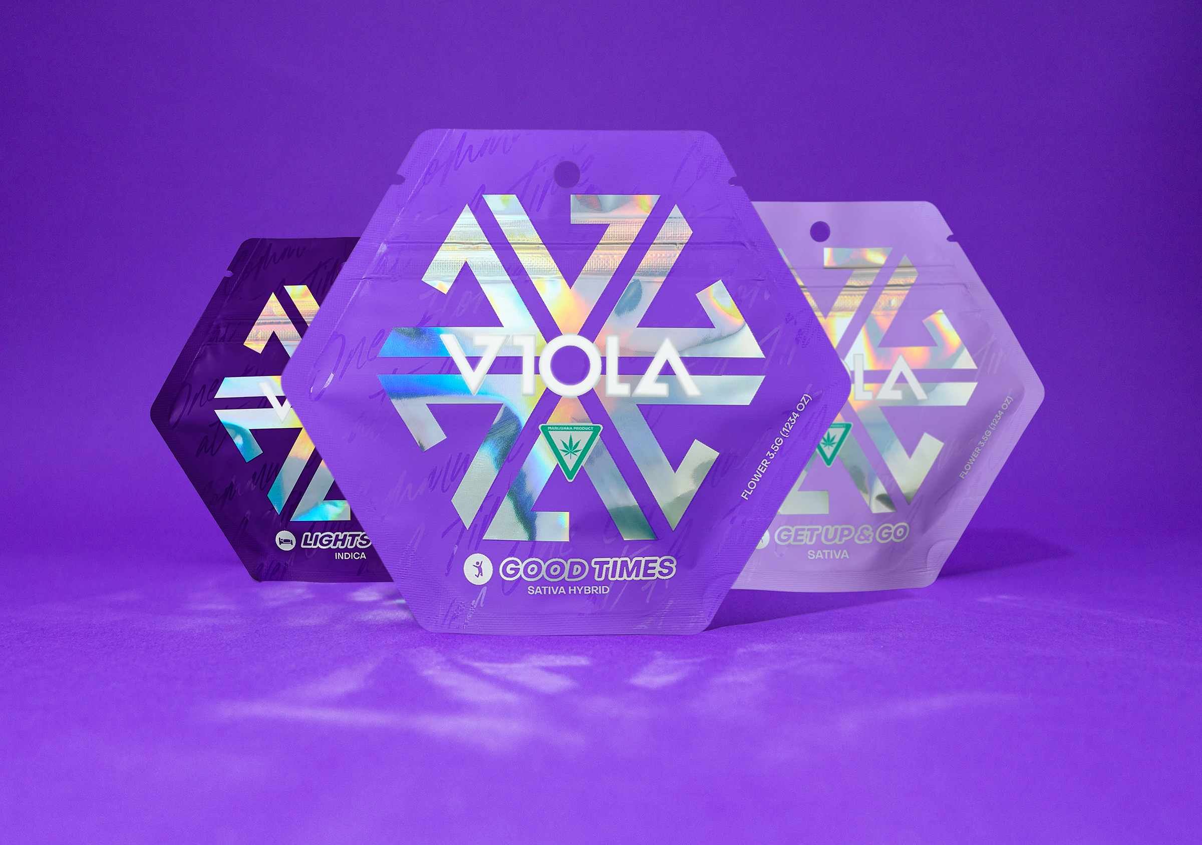
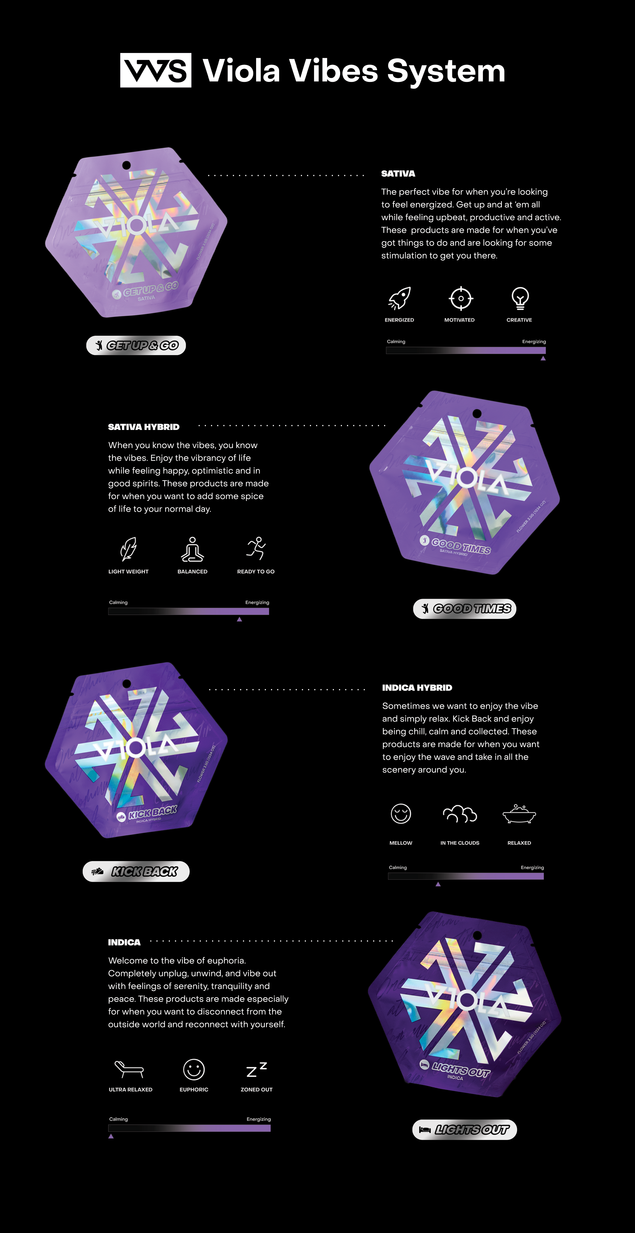
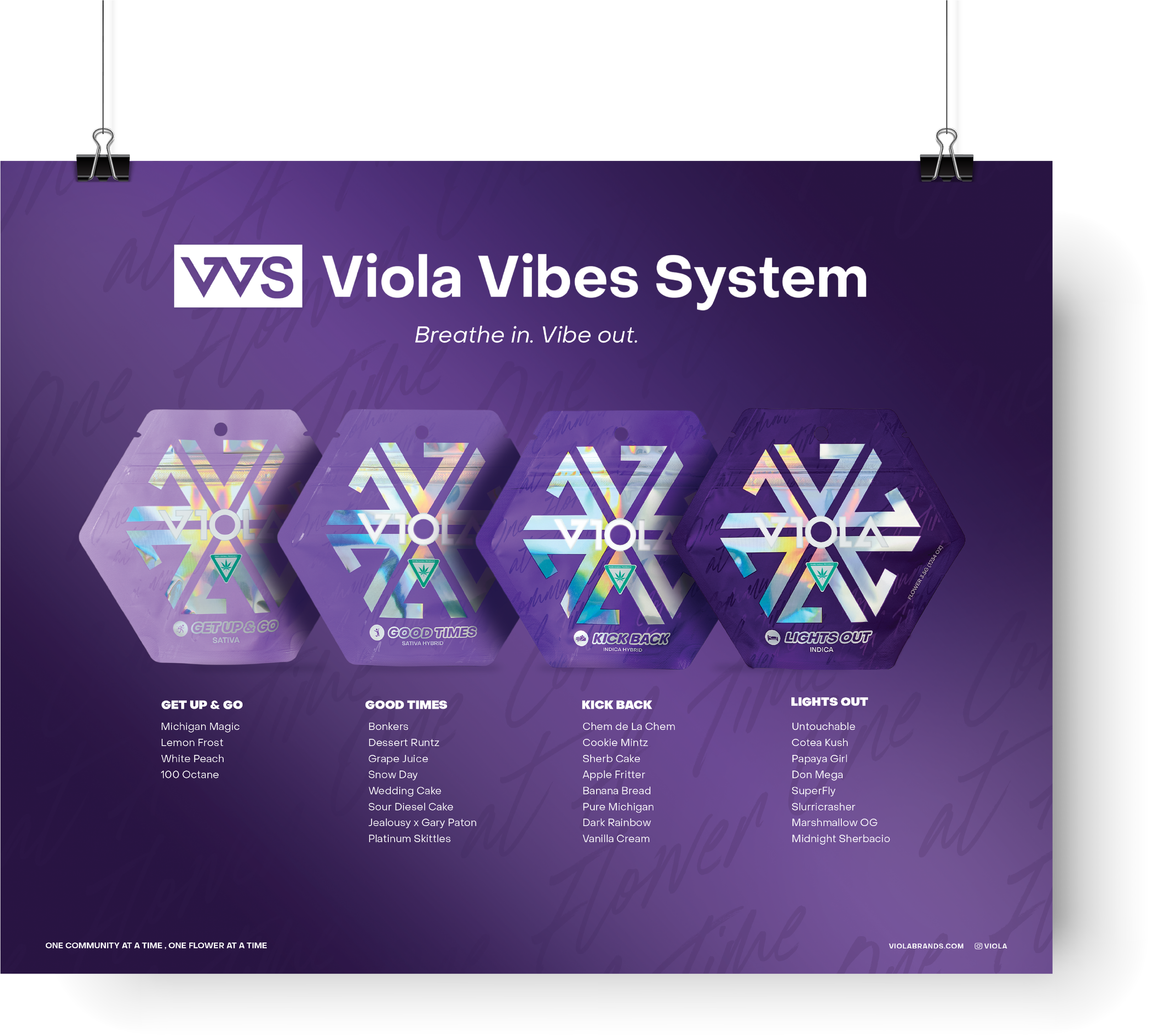
Working with the company’s owner, Al Harrington, our team established VVS - the Viola Vibe System. From there I developed new packaging and a new system of colors that aligned and represented the effects of each of our 4 “vibes.” During this project, I researched and explored packaging trends in the industry as well as hype apparel and high-end fragrance design trends. After falling in love with the visually stunning effect of holographic print I began to create a visual system of design, rooted in our core brand color, but bolstered by the mesmerizing and ever-changing appearance of this holographic print. Using this texture as a through-line for each product created consistency to build on and represented the elusive feeling marijuana brings to its host. This project launched our brand into a new era of visual exploration that went hand in hand with product development. Creating these four personas: Get Up & Go, Good Times, Kick Back, and Lights Out was a challenge that brought me a deeper understanding of our customer’s perspective in the market. This system both highlights a feeling you know and guides you to that feeling you crave. I enjoyed building the framework of this brand through packaging and this project quickly became one of my favorite projects.
Creative direction, strategy, branding & packaging design
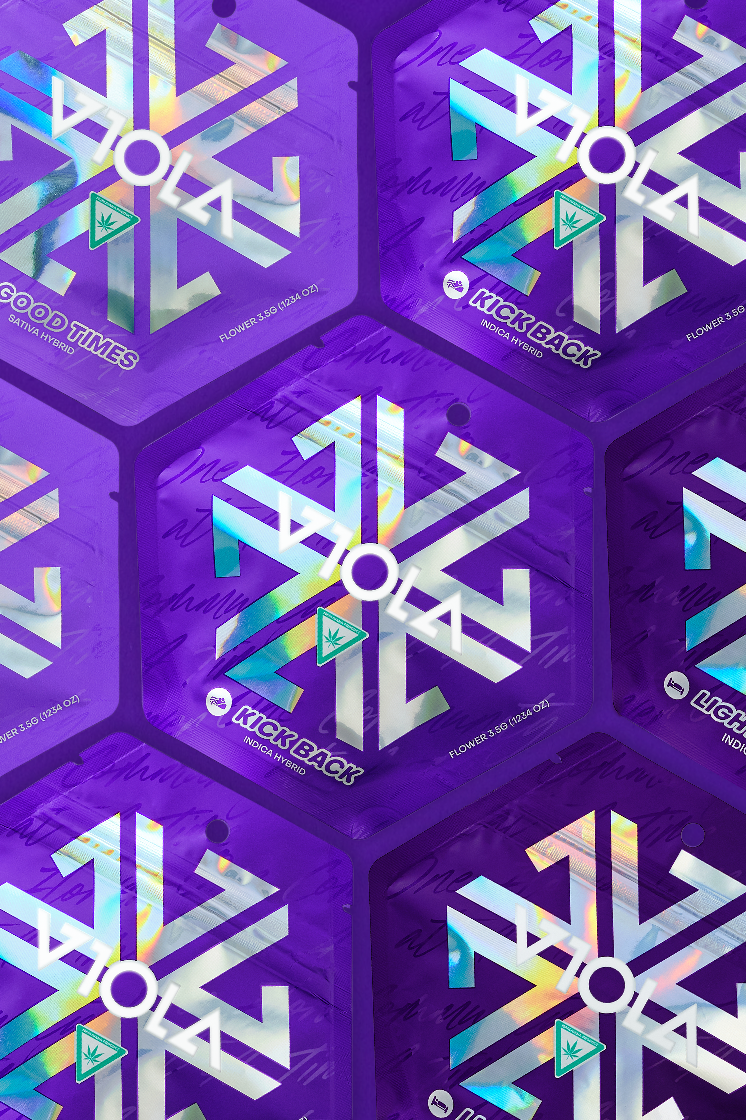
A reimagining of the premium product that Viola is known for. I created a visual system for the amorphous feeling cannabis can bring. Using holographic elements and playing with form, these mylars are both visually dynamic and memorable. This product system highlights the ease and accessibility of joy through cannabis.

A design system
to build on
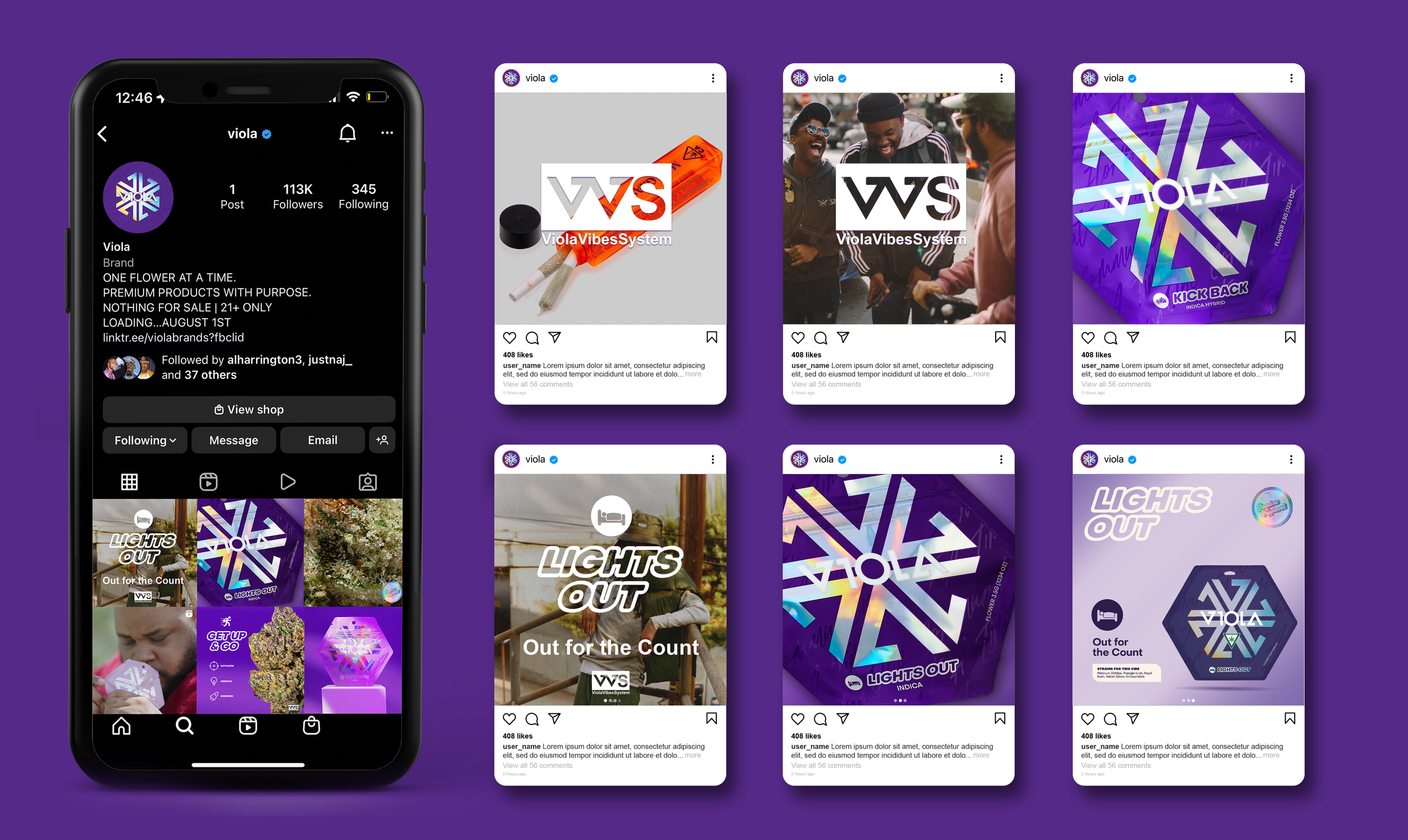
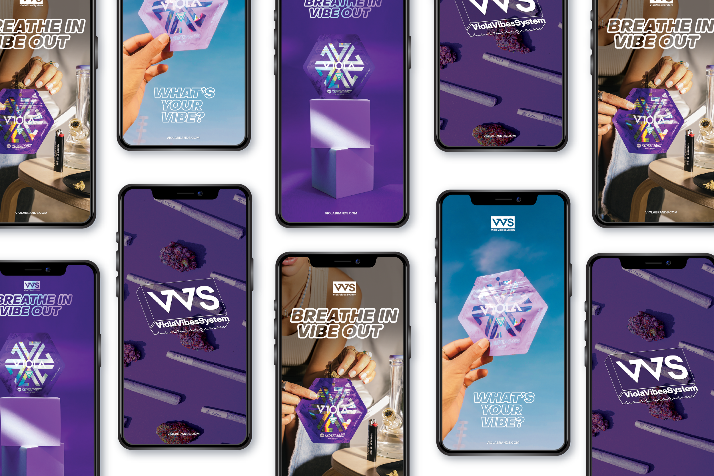
Working with a talented copywriter and our Head of Marketing, I created 4 unique identities for the four vibes. Using iconography, I built personalities for each of the four product categories, a system that serves as the basis for all of Viola’s upcoming products.
The Rollout
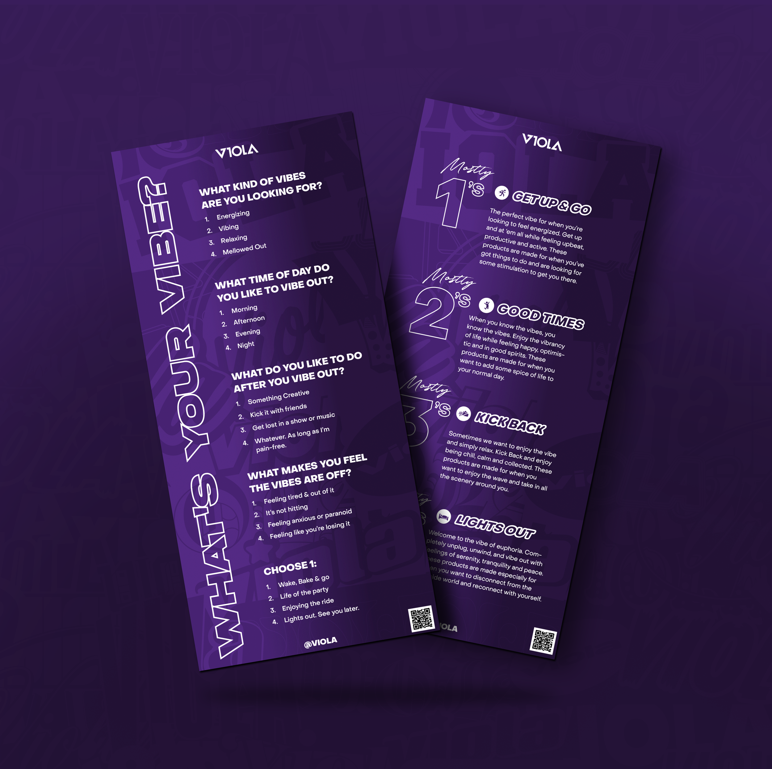
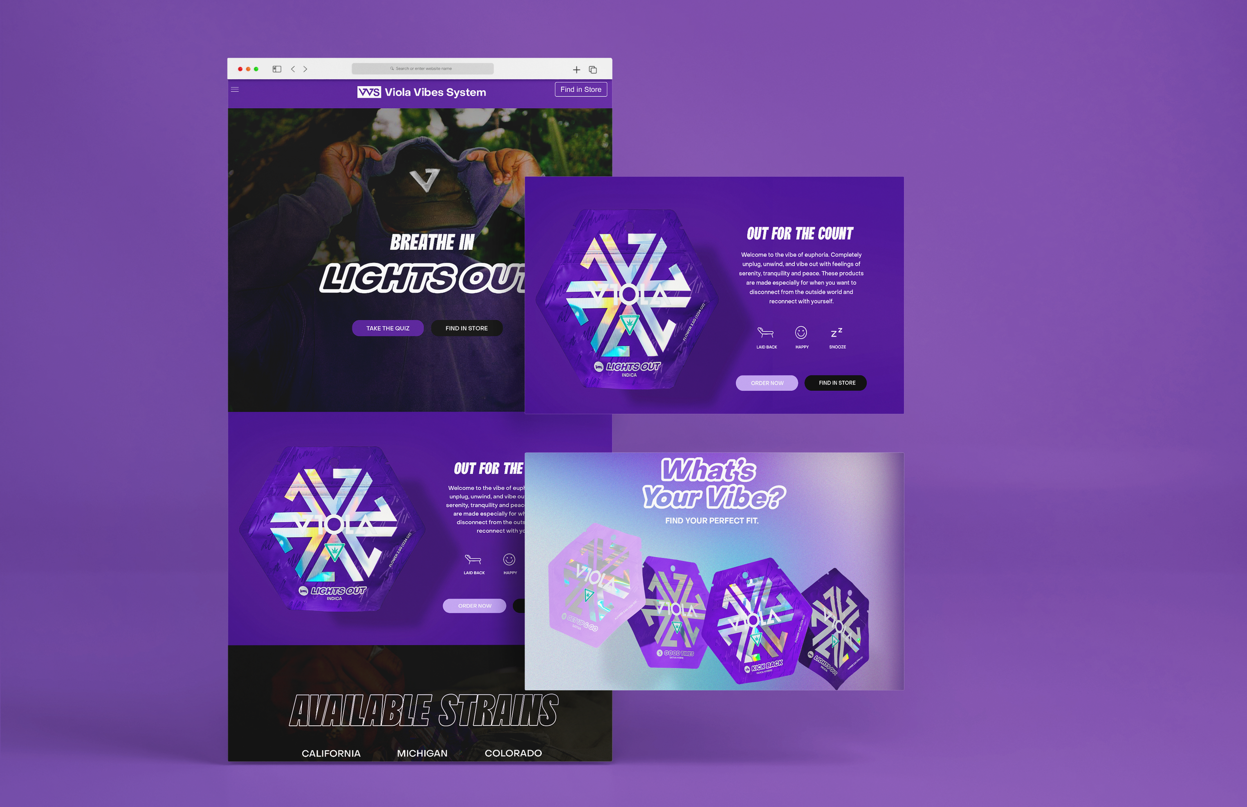
Throughout this product rollout, I managed the packaging production of the Mylars as well as an ever-changing team of designers. I created visual styling for all marketing material and through web, social, print, OOH, video, motion, experiences, and seeding.




Product Expansion
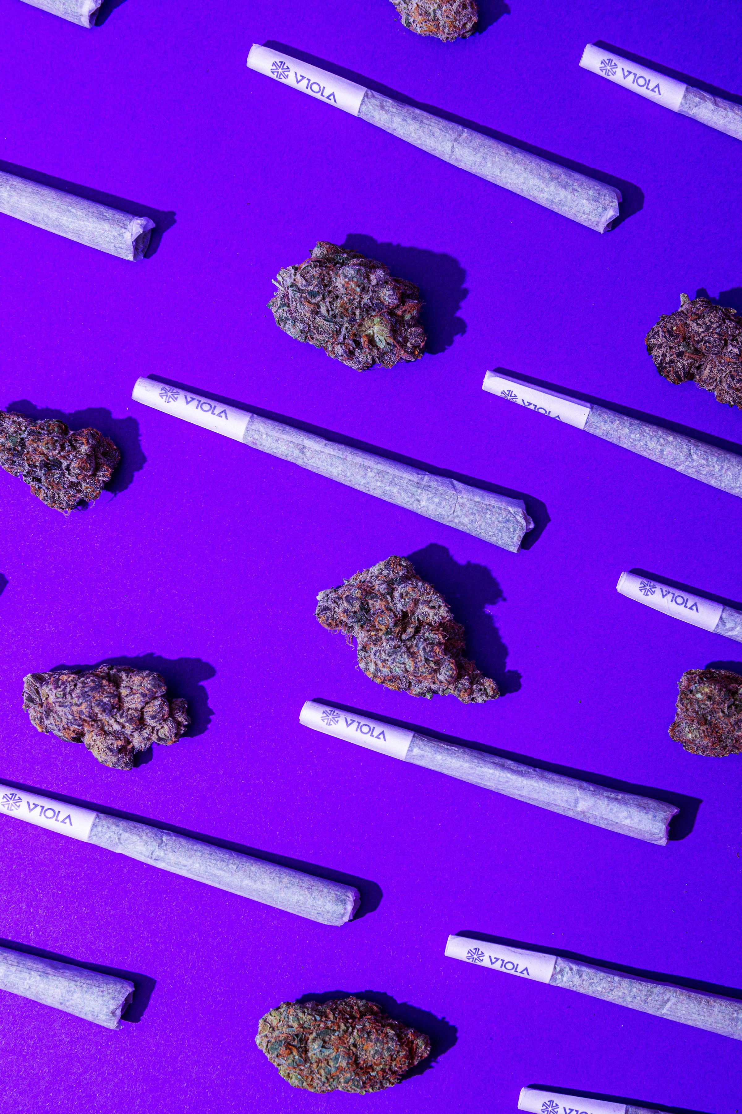
I used the same base design system to expand the flower line through to other forms of consumption. Creating a world of products that would satisfy every corner of the market. Working with the honeycomb pattern was fun to explore as well as other forms of packaing.
Store Takeovers
We partnered with several dispensaries in multiple states to build out unique customer experiences. By working with the store owners, I created visual mockups for the initial rollout.
POS Mockups
Working with vendors I created a multitude of high-fidelity mockups for product display.


